

━━━━━━━━⊱⋆⊰━━━━━━━━
Brand Identity
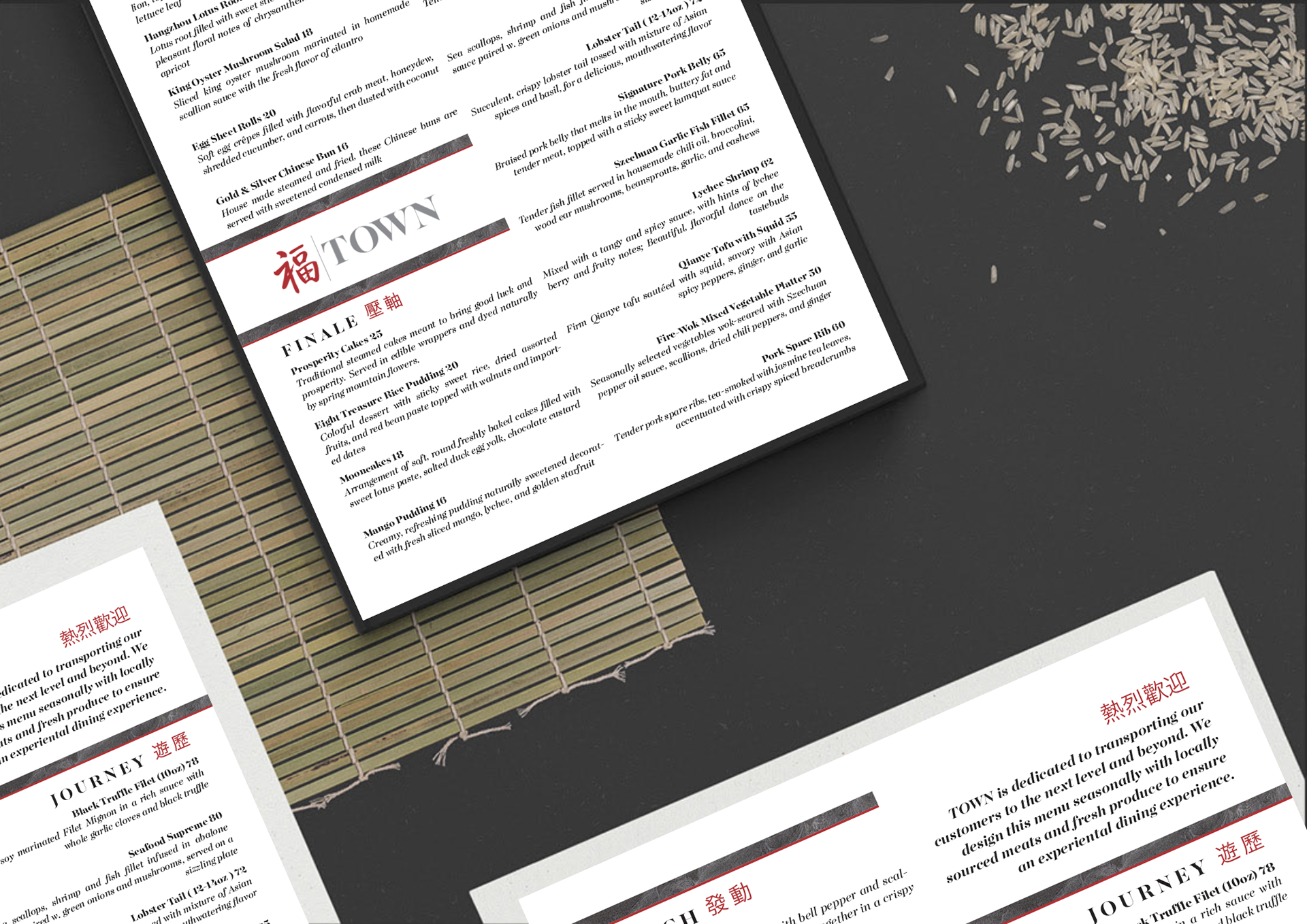
Town | Luxury Chinese Restaurant
Overview:
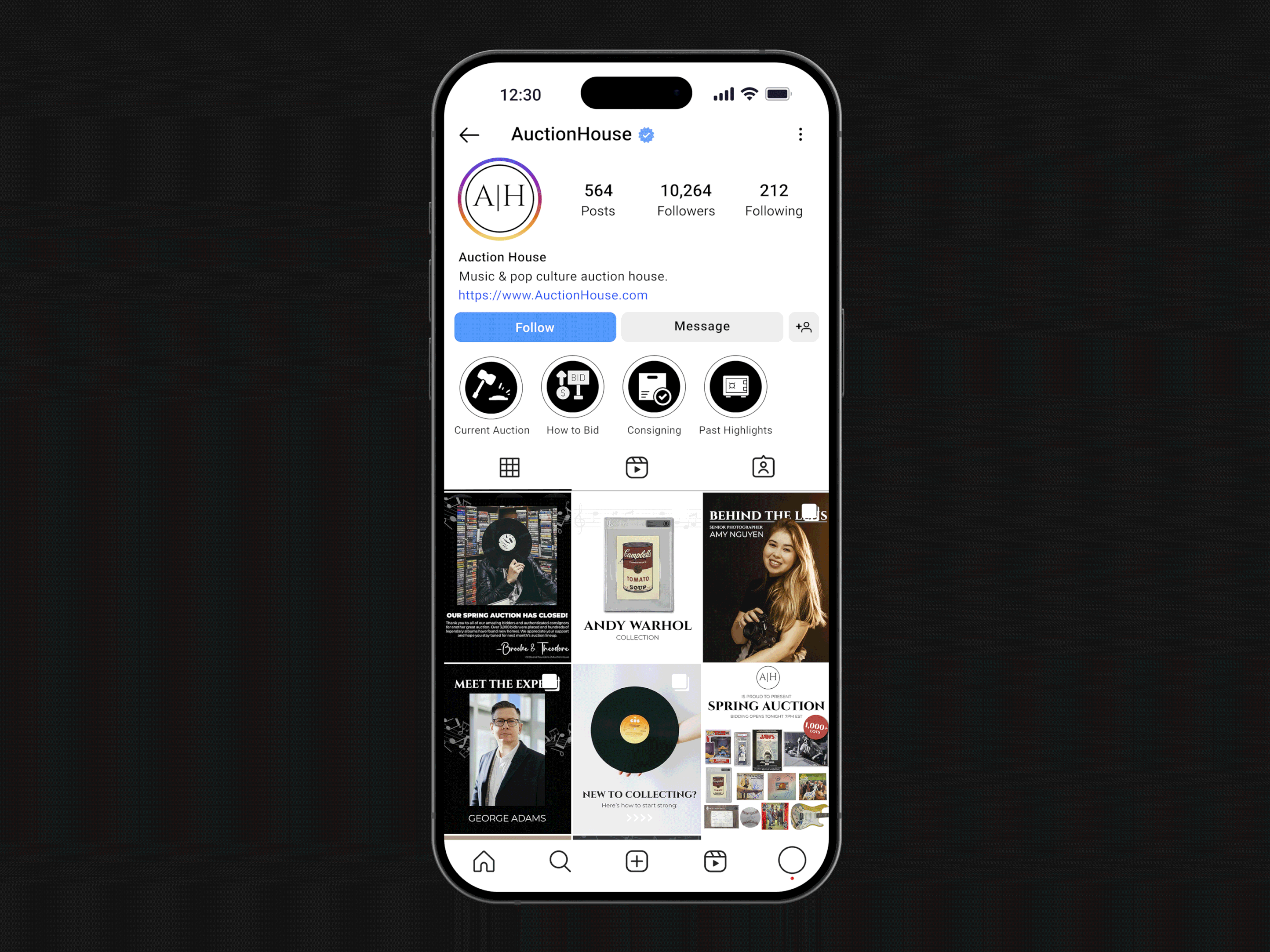
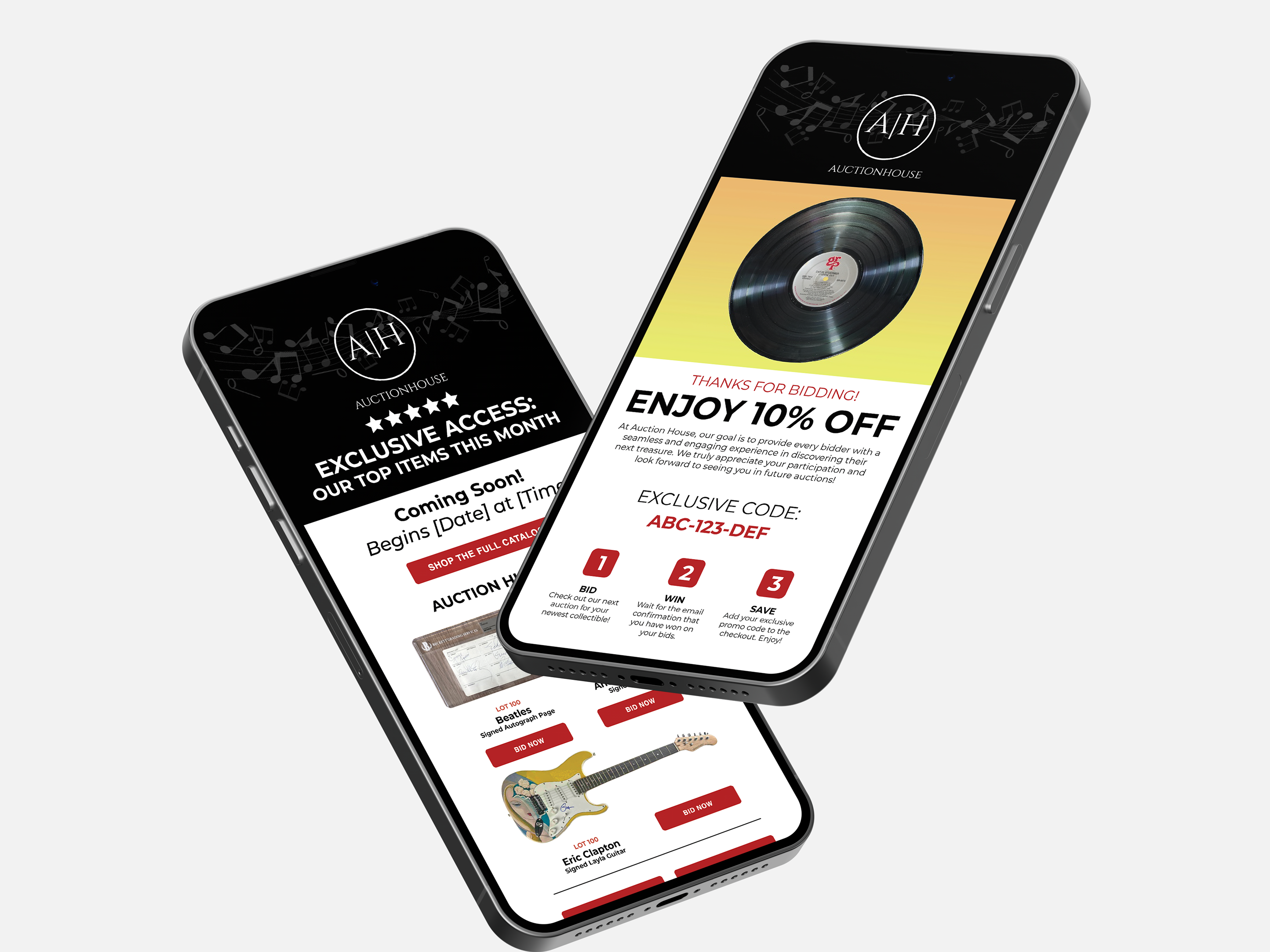
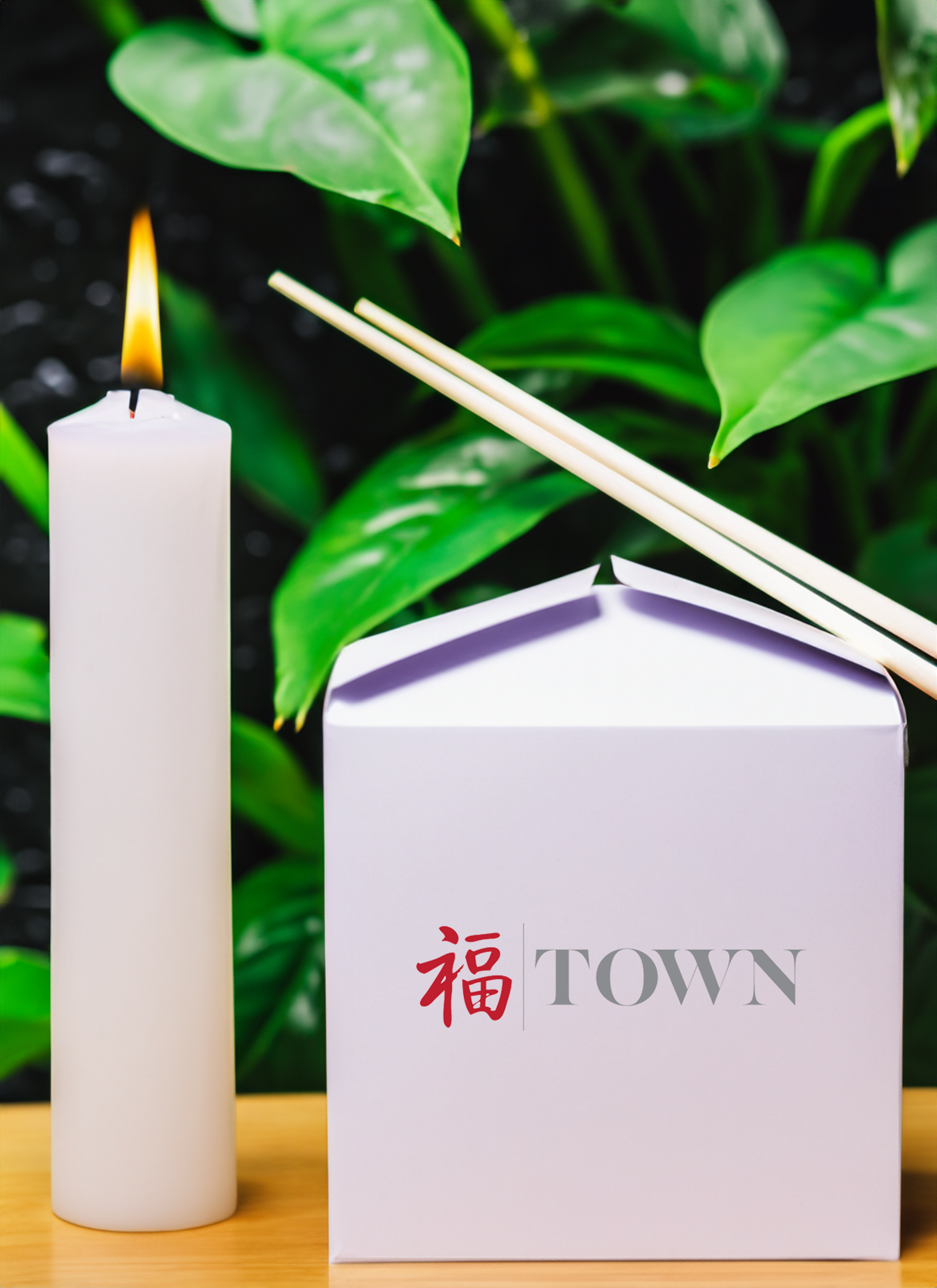
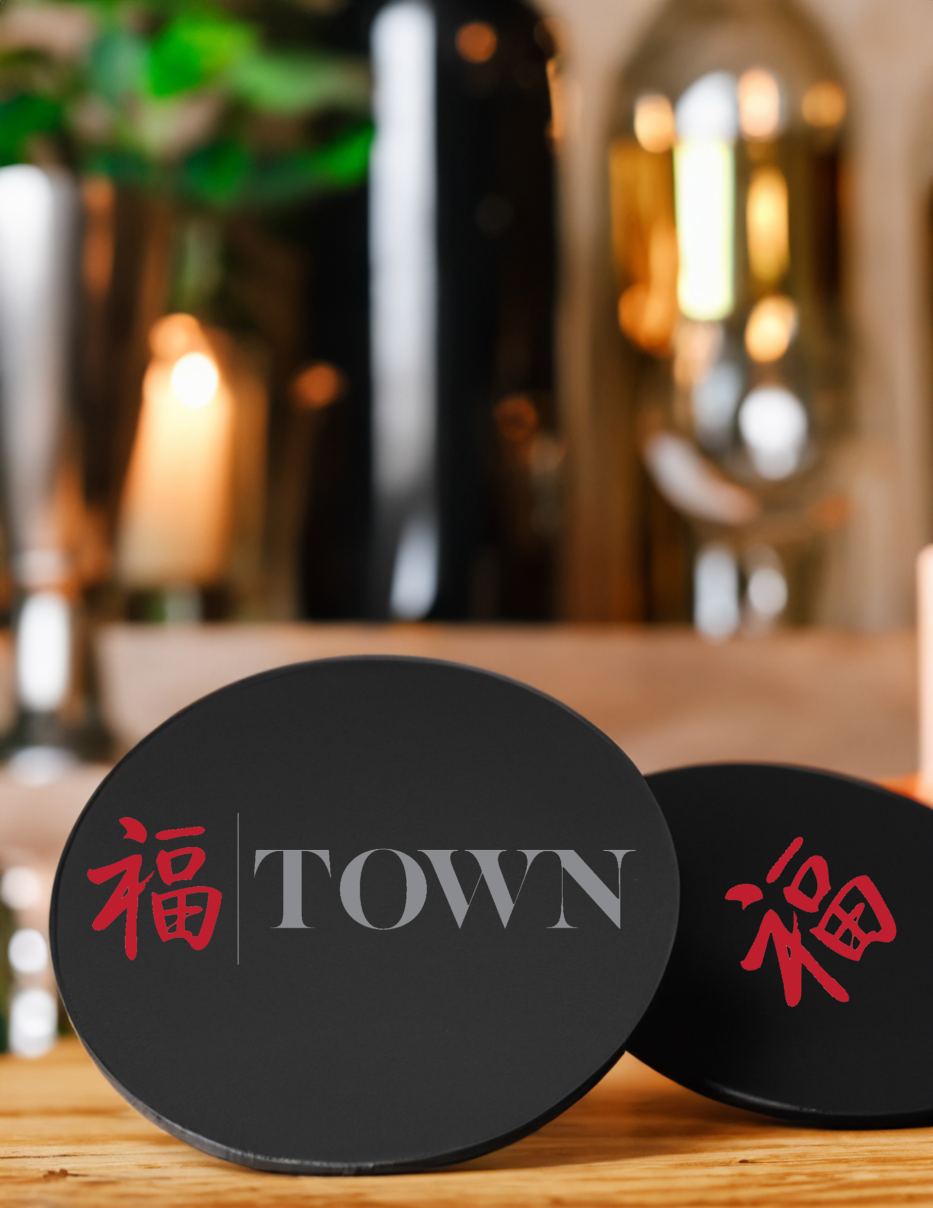
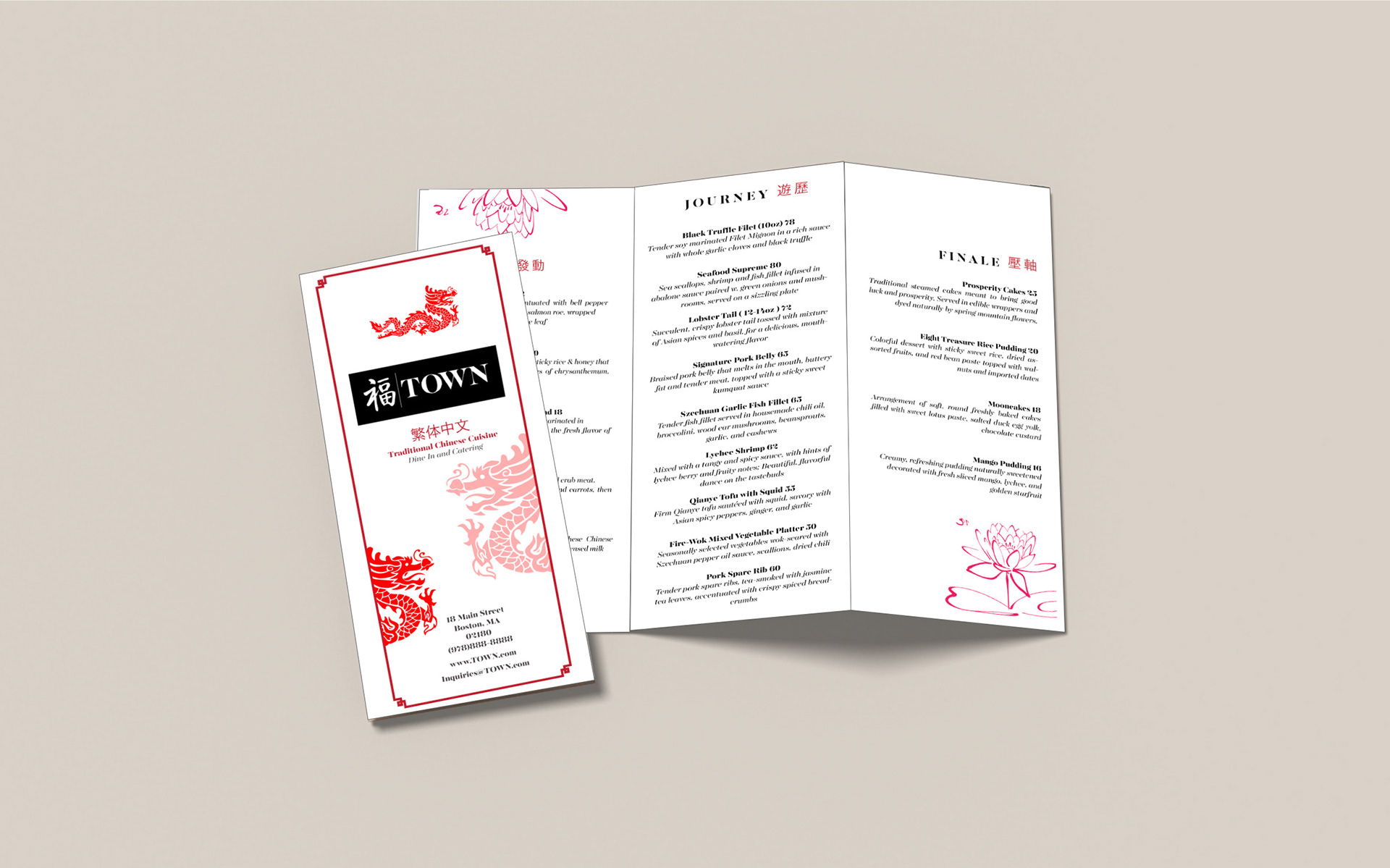
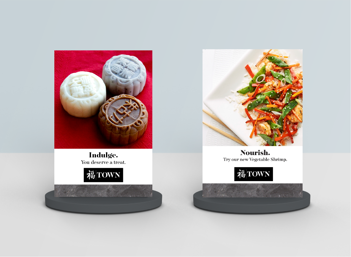
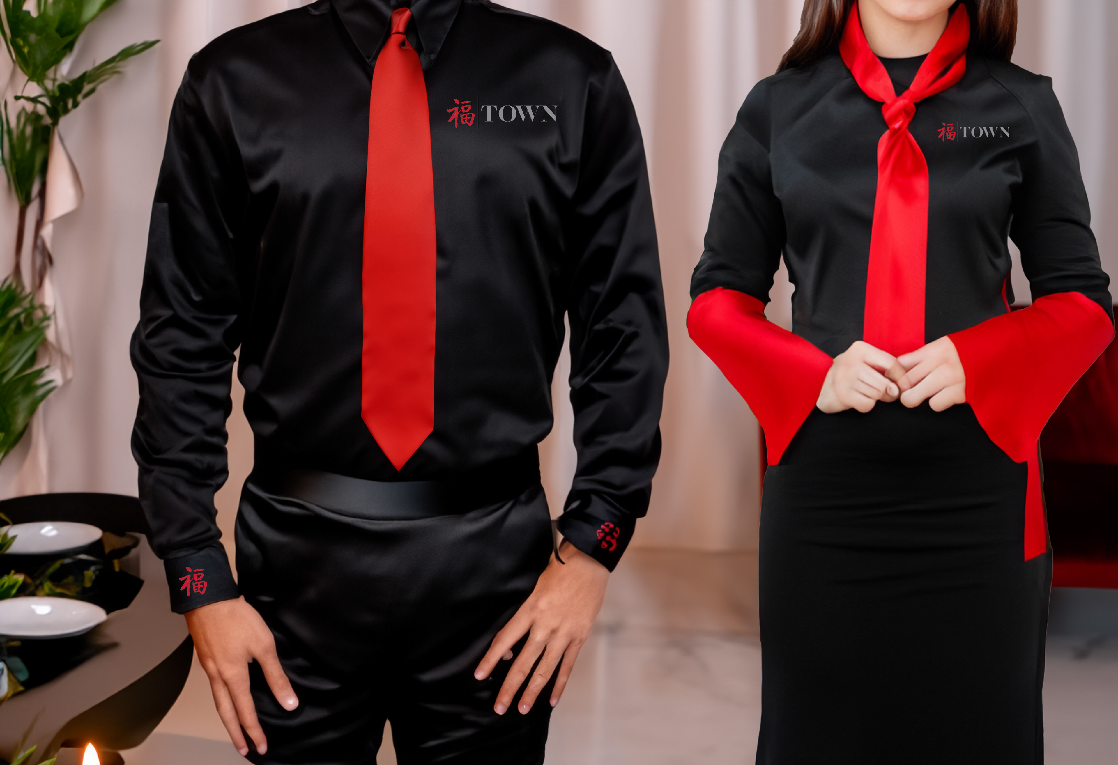
As part of a college assignment, I developed branded materials for TOWN, a luxury Chinese restaurant. Using the provided brand guide, I created menus, table tents, uniforms, takeout boxes, coasters, and a website concept.
As part of a college assignment, I developed branded materials for TOWN, a luxury Chinese restaurant. Using the provided brand guide, I created menus, table tents, uniforms, takeout boxes, coasters, and a website concept.
Design Highlights:
I worked with the established logo, fonts, and values to build a cohesive system that felt both authentic and refined. A rich color palette, traditional motifs like dragons and lotus flowers, and spacious layouts conveyed elegance while celebrating cultural roots.
I worked with the established logo, fonts, and values to build a cohesive system that felt both authentic and refined. A rich color palette, traditional motifs like dragons and lotus flowers, and spacious layouts conveyed elegance while celebrating cultural roots.
━━━━━━━━⊱⋆⊰━━━━━━━━
POSTER DESIGN
Melanie Martinez | "Crybaby"
Birthday Party Tour Poster
Overview:
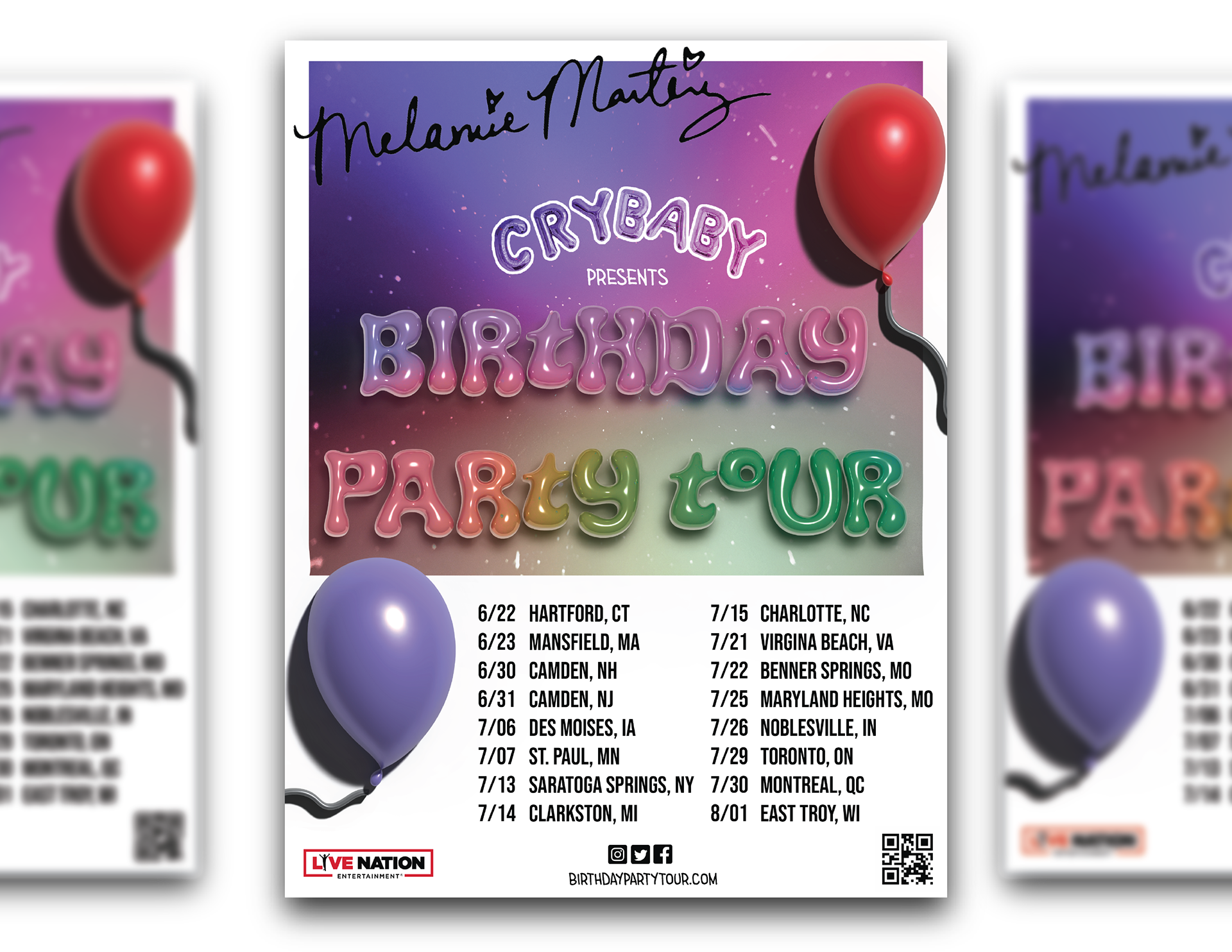
As a passion project, I designed a tour poster inspired by Melanie Martinez's whimsical and surreal aesthetic.
As a passion project, I designed a tour poster inspired by Melanie Martinez's whimsical and surreal aesthetic.
Design Highlights:
The design incorporated playful 3D-style typography, pastel gradients, and illustrated balloons to reflect the “birthday party” theme. Bold date listings anchored the layout, ensuring clarity while preserving the dreamy, colorful vibe.
The design incorporated playful 3D-style typography, pastel gradients, and illustrated balloons to reflect the “birthday party” theme. Bold date listings anchored the layout, ensuring clarity while preserving the dreamy, colorful vibe.
━━━━━━━━⊱⋆⊰━━━━━━━━
print design
“Are the Planets Inhabited?” | Magazine Spread
Overview:
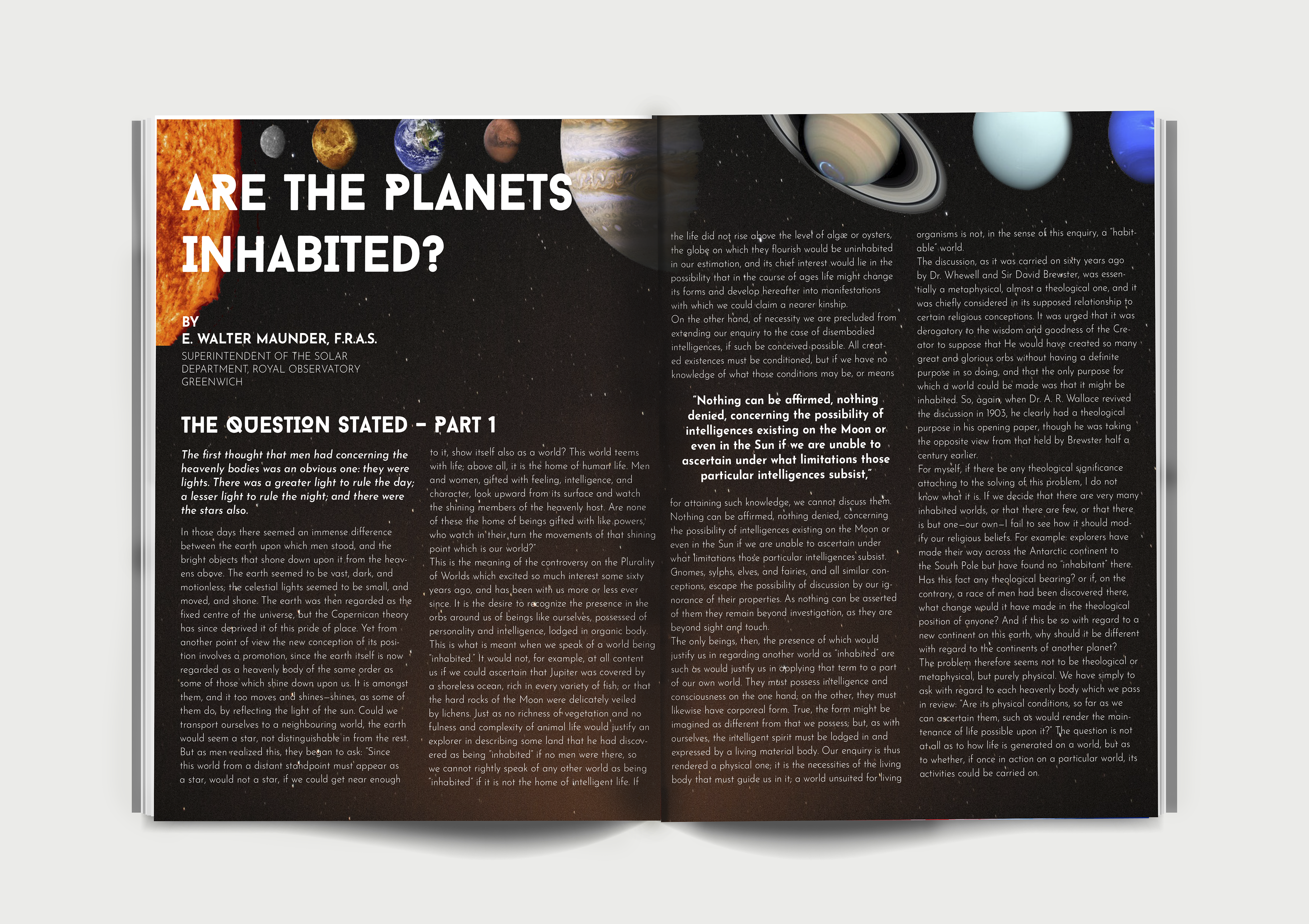
This college assignment challenged me to transform a dense scientific article into a visually engaging magazine spread.
This college assignment challenged me to transform a dense scientific article into a visually engaging magazine spread.
Design Highlights:
I paired high-quality imagery of planets with a structured grid layout to balance readability with visual interest. Typographic hierarchy guided readers through long passages of text while negative space prevented the spread from feeling overwhelming.
I paired high-quality imagery of planets with a structured grid layout to balance readability with visual interest. Typographic hierarchy guided readers through long passages of text while negative space prevented the spread from feeling overwhelming.
━━━━━━━━⊱⋆⊰━━━━━━━━